
Azerbaijan is a small Muslim country where most of the population does not consume alcoholic beverages.
That's why alcohol production is underdeveloped in the country. The design of local alcohol brands is unattractive and uninteresting. The reason is the lack of funds for producers to involve professional designers. This leads to
the fact that the employees without specialized education and qualifications create the package design which
usually is created on the basis of meaningless clipart and sometimes it's just a plagiarism of foreign
analog.
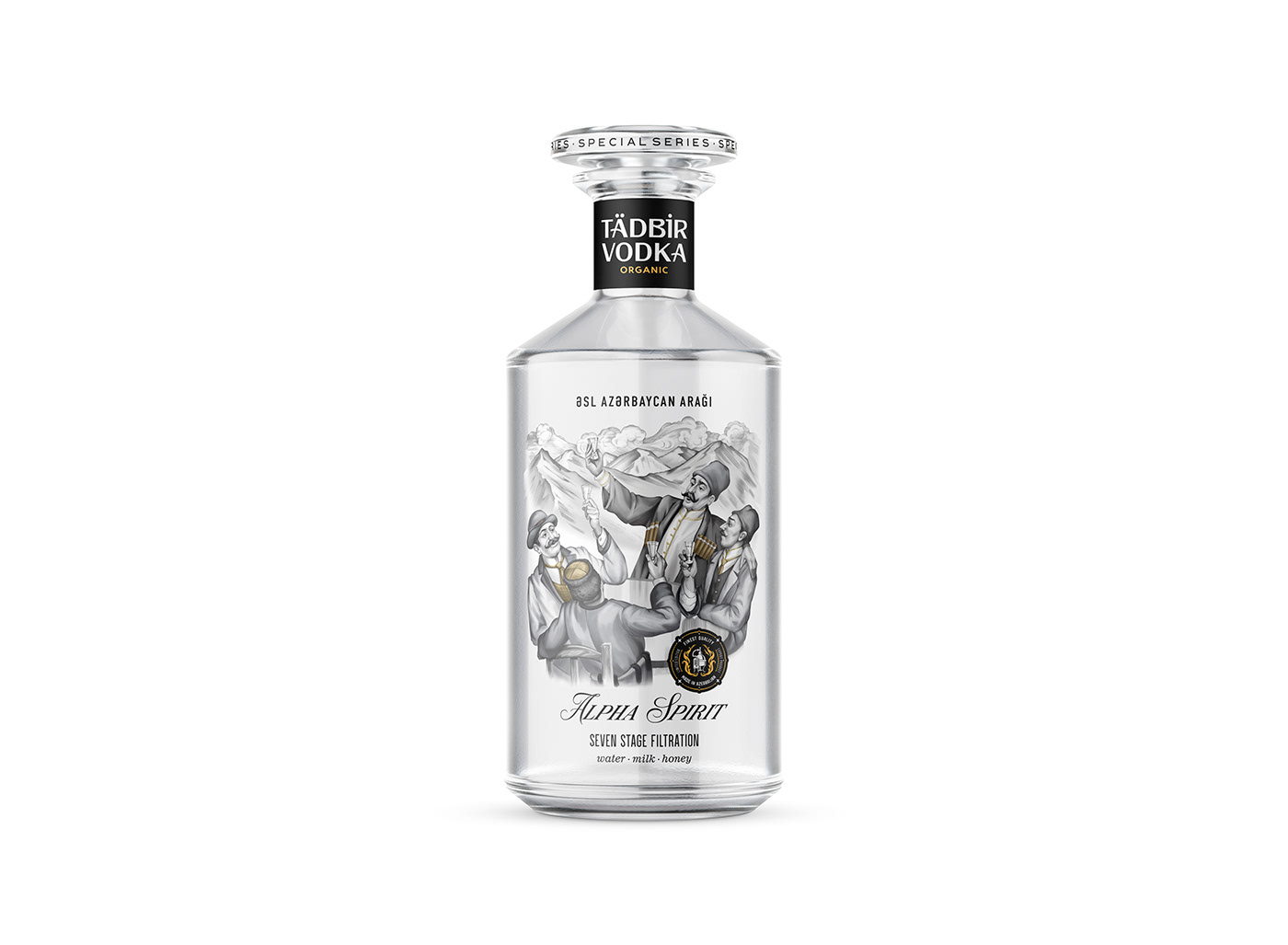
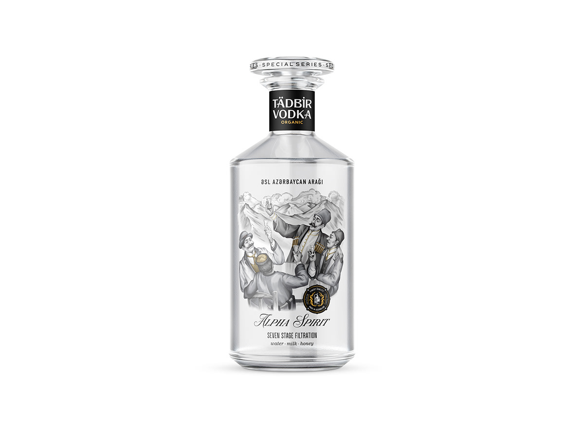
One of the local producers decided to break this vicious circle and create a brand able to compete on equal terms with foreign alcoholic beverages. So I received a request to create a vodka design. In translation, the drink’s name meant “vodka for the event”. That’s why I suggested the client depict a feast scene on the label. This idea was accepted immediately though it was quite difficult to choose the composition itself. Neither was the consensus on how the scene should look. One idea was that the feast scene should be in the form of a frame around the name of the drink, the second idea assumed the creation of a main character and a feast scene in the background but I had the third idea. It was somewhat simpler so I thought about a feast scene at a round table where one of the characters was proposing a toast in a typical local manner.
That's why alcohol production is underdeveloped in the country. The design of local alcohol brands is unattractive and uninteresting. The reason is the lack of funds for producers to involve professional designers. This leads to
the fact that the employees without specialized education and qualifications create the package design which
usually is created on the basis of meaningless clipart and sometimes it's just a plagiarism of foreign
analog.
One of the local producers decided to break this vicious circle and create a brand able to compete on equal terms with foreign alcoholic beverages. So I received a request to create a vodka design. In translation, the drink’s name meant “vodka for the event”. That’s why I suggested the client depict a feast scene on the label. This idea was accepted immediately though it was quite difficult to choose the composition itself. Neither was the consensus on how the scene should look. One idea was that the feast scene should be in the form of a frame around the name of the drink, the second idea assumed the creation of a main character and a feast scene in the background but I had the third idea. It was somewhat simpler so I thought about a feast scene at a round table where one of the characters was proposing a toast in a typical local manner.


After composition approval disputes began regarding the style of drawing. The client shared different styles of drawing each time changing his decision. So it turned out that one composition was made in five different styles, in vector and raster graphics.


Along with the work on the composition, the typography also continued. Uncertainty was even in the spelling of the brand name. There was a suggestion to divide the name into two parts: the first part should be written in letters and then to put the digit 1 instead of the second part as “Tad1” (1 is spelled “bir” in Azeri). So it became necessary to write the names by hand and to make it easier to pick a choice I simultaneously worked on three options. I also made several variants based on sans and sans serif fonts.


Within one month I did a lot of work in raster and vector graphics, engravings, and lettering. Some of the work was done with pencil and ink on paper and the rest on a digital tablet.
The products you make may be of a high quality and at an affordable price but its plain look can deprive you of a competitive advantage. It doesn't matter where you are if your business is facing similar problems and you need expert help, contact me. I am a qualified design professional with about 30 years of experience; I do all the work by myself that’s why my service costs are 70-80% more affordable than in design agencies; 90% of my work is made under the NDA (Non-disclosure agreement); I do not post these works in my portfolio and upon the project completion I transfer to the client not only the commercial rights but also copyrights without any additional payments.


